POKÉ CATCHER
UX/UI Design | Front-End Development | Illustration | Logo | Brand
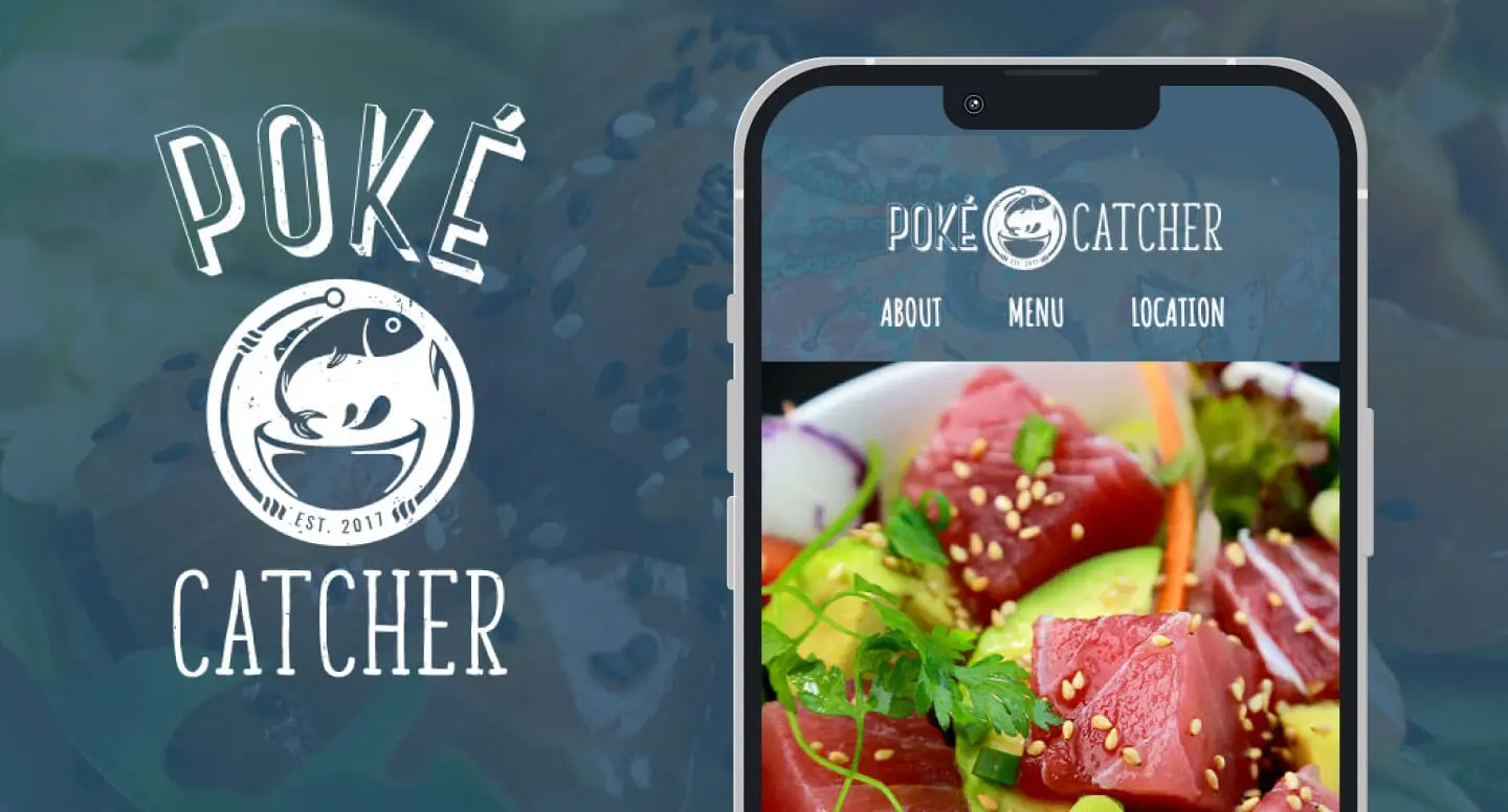
Poké Catcher is a restaurant that serves Hawaiian style fish salad in the Phoenix area. The brand is designed to reflect the vibrant colors and inviting atmosphere of their interior location.
INFO
Developed with:
Bootstrap , HTML, CSS, JQuery
www.pokecatcher.restaurant
OVERVIEW
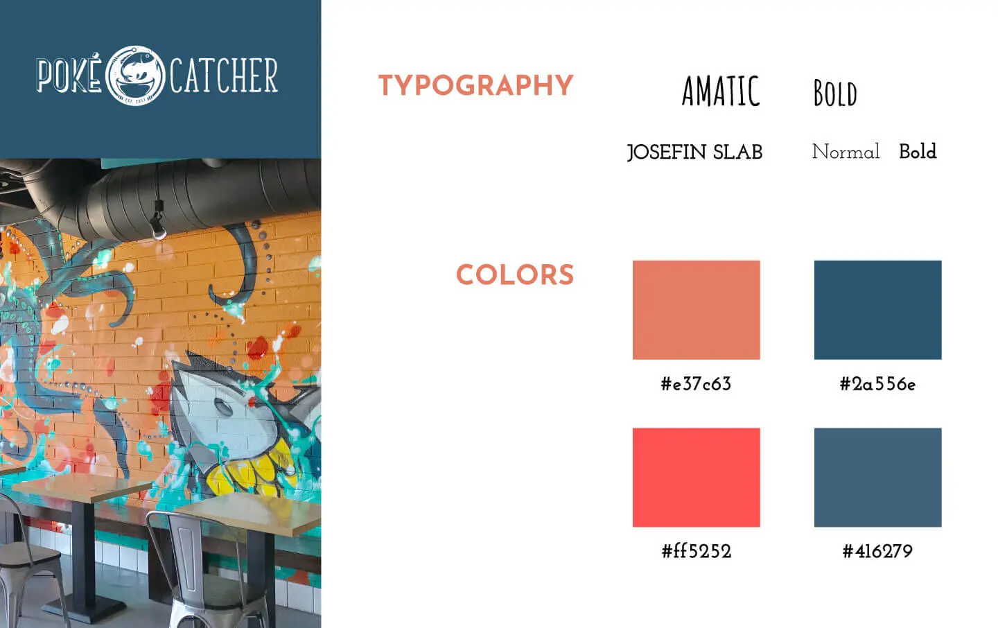
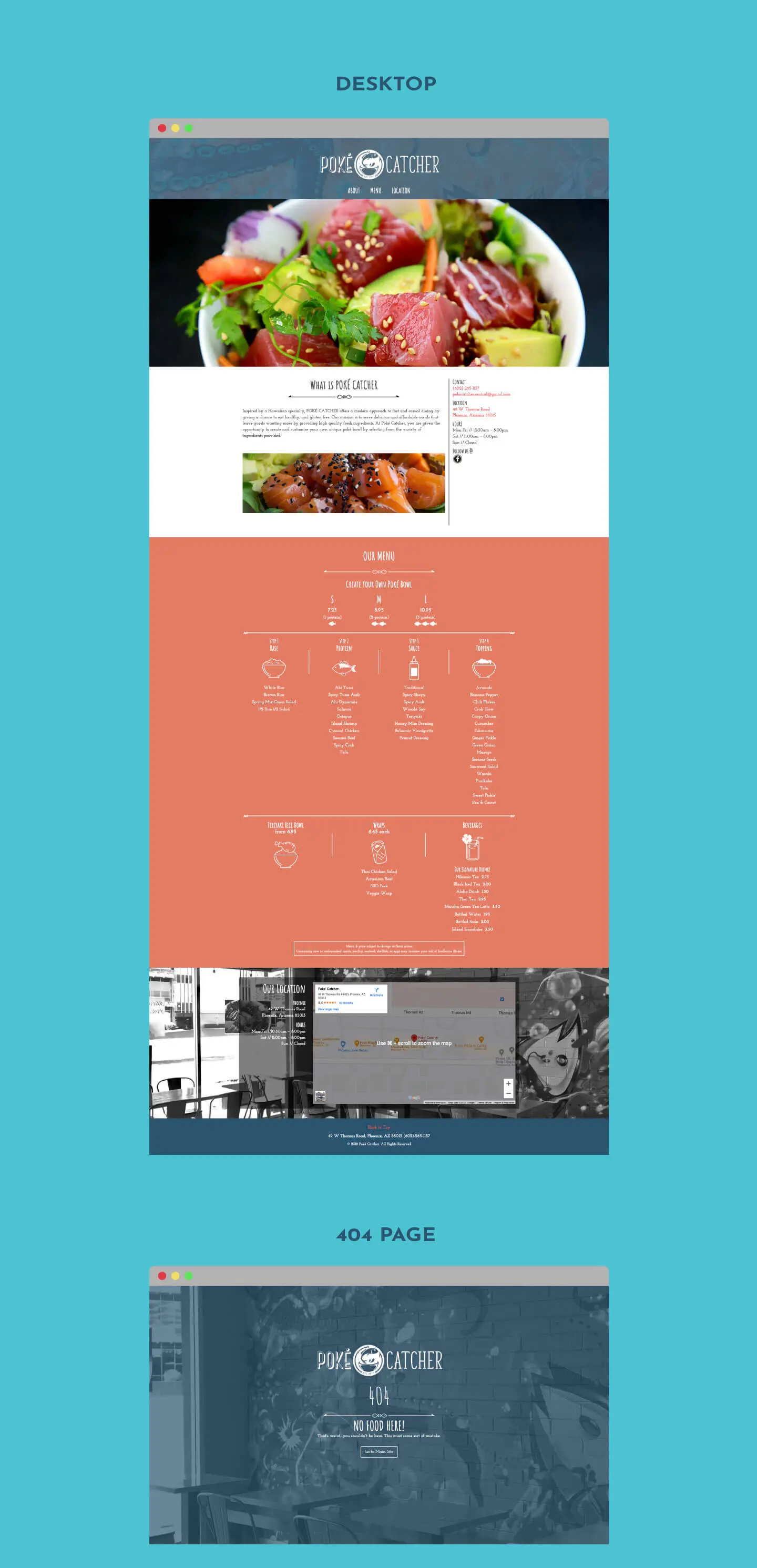
Poké Catcher's logo is heavily inspired by nautical style aesthetic, which provided a unique and appropriate visual representation for the brand. As part of my task, I was responsible for coding a single page website to showcase the brand and ease of navigation. The brands color scheme derived from the beautiful wall mural of the restaurant's interior. Later, I had the chance to revist and improved the website's visuals and user experience by revising the food menu and incorporating custom illustrated icons. These revisions added a personal touch to the website and helped to differentiate it from competitors.
UX REVIST
CHALLENGE
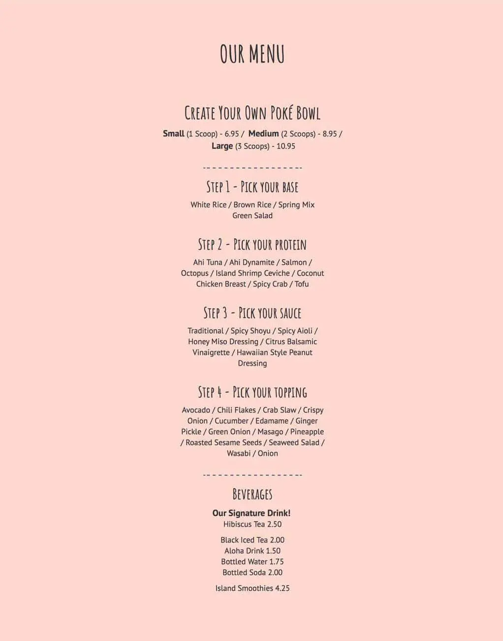
In the inital launch of the site, it was already known the design of the food menu section needed to be revisited. The layout was very bare and lacked in personality to the overall branding. Also, the format sytle of items listed was not great for readability. It reduces scrolling but the spacing between the items felt cluttered and not optimal for skimming.
RESEARCH
Turning to various poke bowl resuarants around the Phoenix area as well as other sites helped narrow down the suitable menu design.
- High quality Photography associating each food item: Visually assists user with item but could lead to more scrolling, also currently limited access to photography.
- Photos with a horizontal scrolling carousel feature: Interesting feature but slower scrolling and not optimal for skimming. Also, swiping the carousel on mobile can cause accidental back/forward page function.
- Vertical listing with section icons no imagery: Lack of images but easy to read.
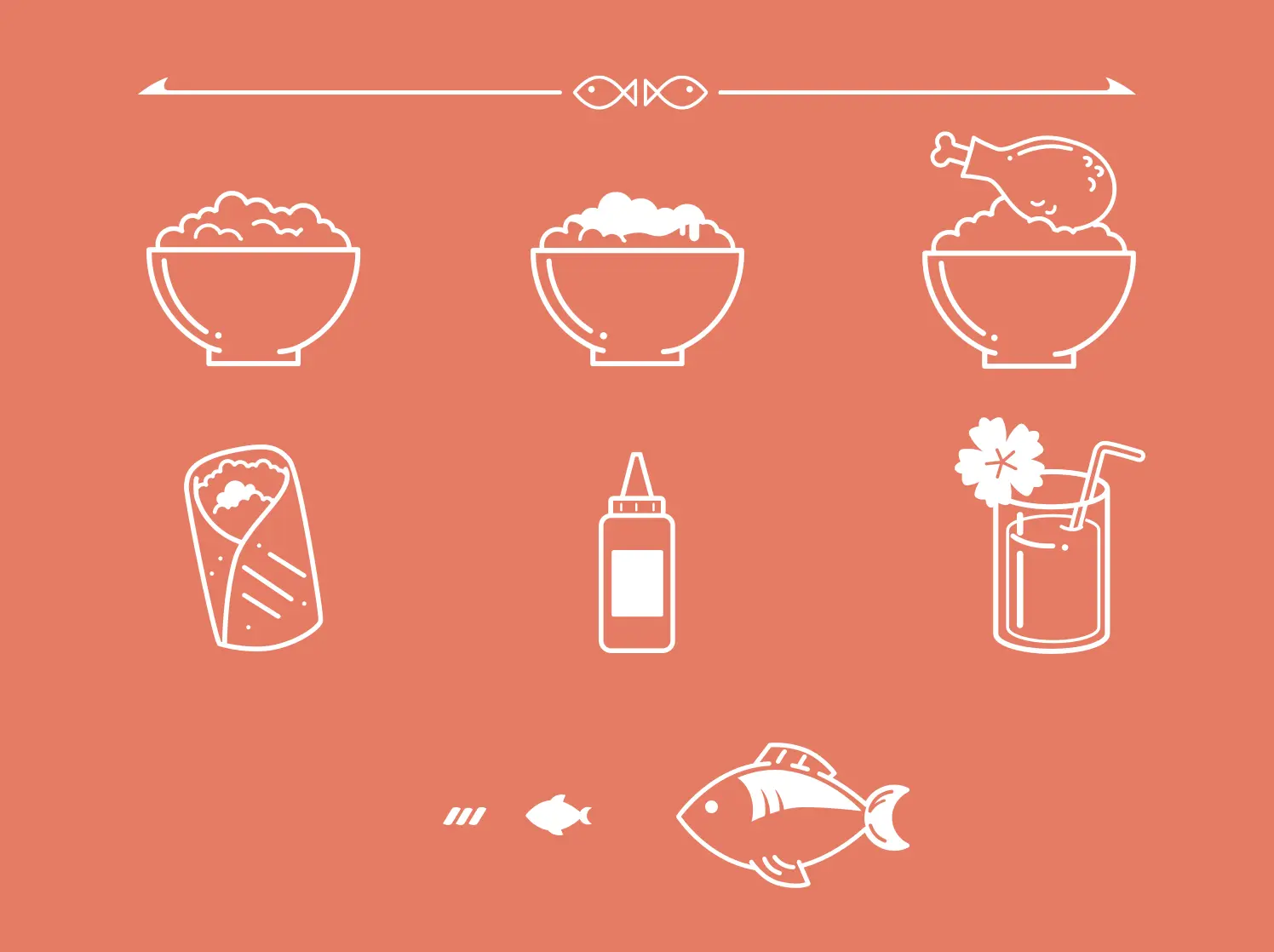
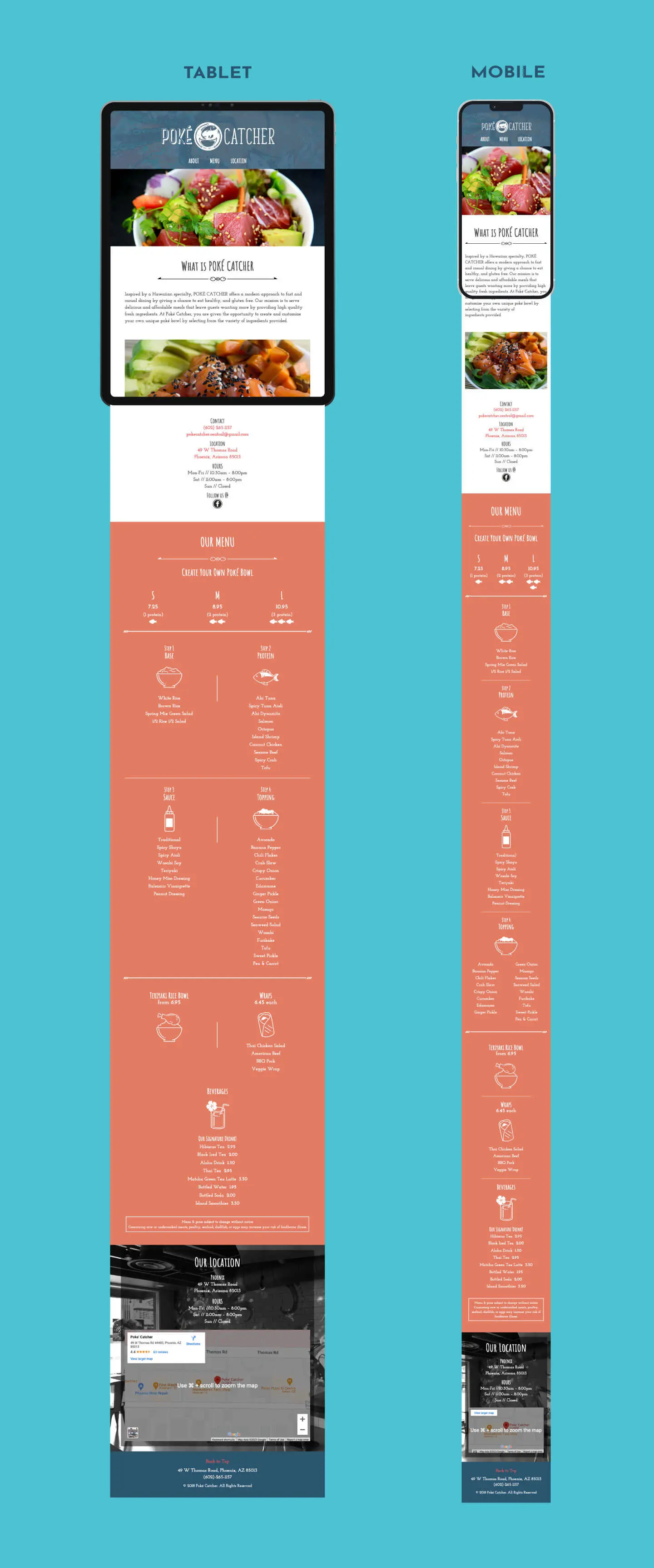
The consensus was to create custom icons with vertical column layout would be suitable. Icons can be easily identify the sections and appropriate for users to comfortably scan the items in the group as a vertical listed format.
DESIGN PROCESS/ DEVELOPMENT PROCESS
The main goal was to create that icons that invoke playfulness/friendliness to them. The original concepts were knocked out color variants but realizing the contrast between the text and the icons were clashing, it was decided to produce a lineart version which allowed more improvised details and character. Upon feedback from peer designers, the lighter background color seemed disjointed and requested more contast with my color scheme. As a result, the new color choice really gave the "pop" it needed. The font needed to be heavier as regualar variant seemed barely legible for eldery demographic.
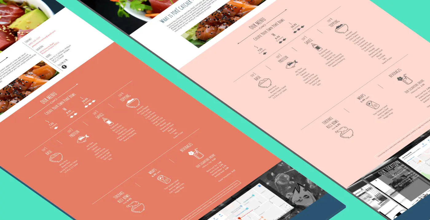
The custom bowl section was split into 2/2 columns to reduce clutter on tablet portrait view. On a mobile device, the toppings column ran extensively and to reduce scrolling, it was necessary to break the list into 2 columns.
FINAL THOUGHTS
Although, the current layout created more vertical scrolling, it was a good sacrifice from a desinger's perpective from the previous. Future iteration will include food images (although the may conflict with the current icons), or more illustrative elements. Hopefully able to get some more photography imagery or image feed.